Short answer: The freight KPIs that matter most are OTIF (on-time in-full), cost per shipment, fleet utilisation, and damage and claims rate. On their own they tell you that something is wrong. A good logistics dashboard connects them to root-cause measures, such as warehouse dwell time, so you can see why and act the same day.
To show what that looks like in practice, we built a sample freight operations dashboard for a fictional national carrier running lanes between Auckland, Hamilton, Tauranga, Napier, Wellington, Christchurch and Dunedin. The data is illustrative, but the structure is exactly what we build for real operations teams.
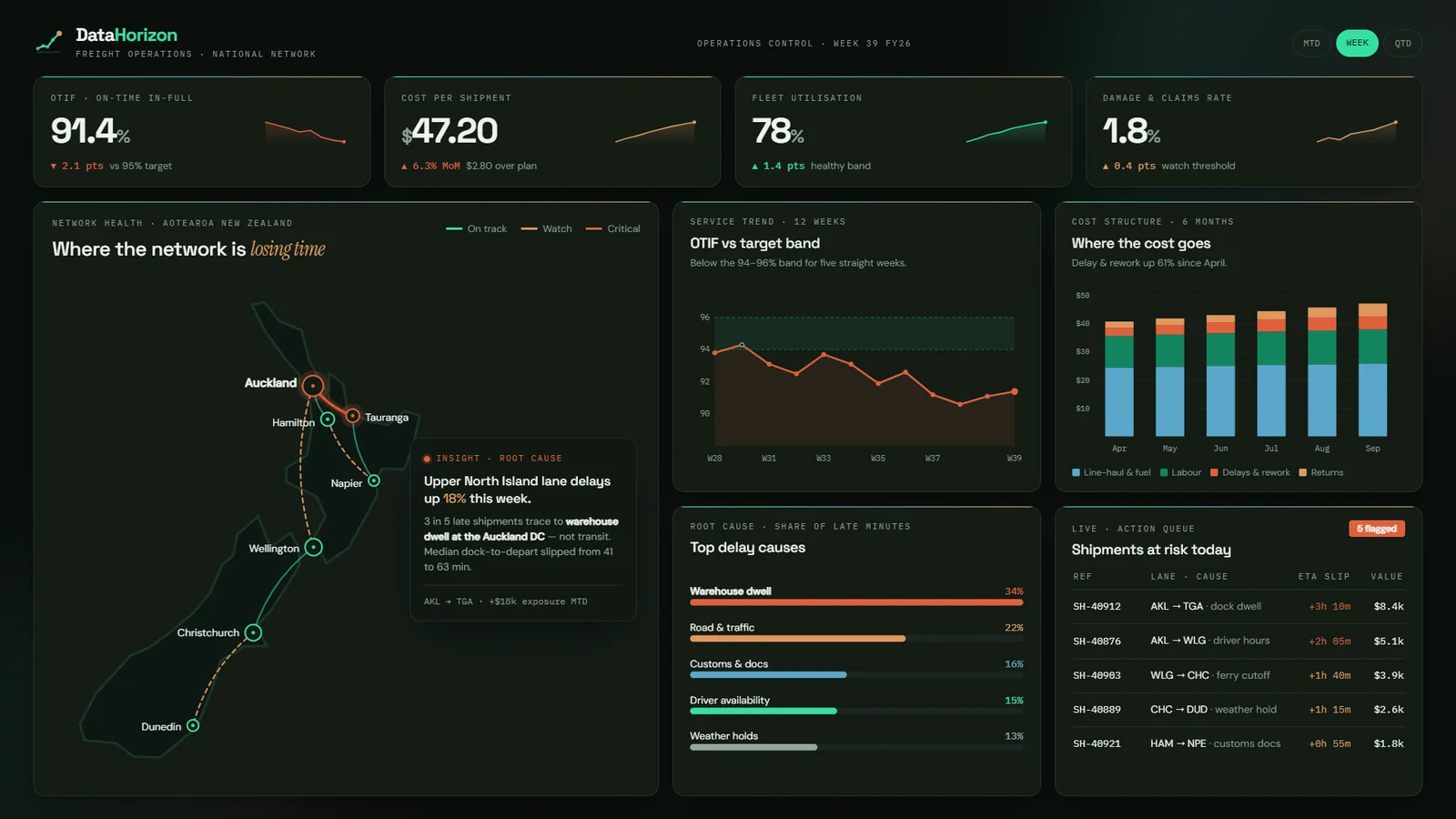
The four headline freight KPIs
Every freight dashboard should open with a small set of measures that the whole business agrees on. These four cover service, cost, asset use and quality.
| KPI | What it measures | How to calculate it | Sample value |
|---|---|---|---|
| OTIF (on-time in-full) | Share of shipments delivered on time and complete | Shipments delivered on time and in full ÷ total shipments × 100 | 91.4%, 2.1 pts below a 95% target |
| Cost per shipment | Average all-in cost to move one shipment | Total freight operating cost ÷ shipments delivered | $47.20, up 6.3% month on month and $2.80 over plan |
| Fleet utilisation | How much available fleet capacity is in use | Capacity used ÷ capacity available × 100 | 78%, up 1.4 pts and inside the healthy band |
| Damage and claims rate | Share of shipments that result in damage or a claim | Shipments with a damage claim ÷ total shipments × 100 | 1.8%, up 0.4 pts and at the watch threshold |
Read together, these four tell a clear story. The fleet is busy and healthy, but service is slipping, costs are rising and quality is starting to wobble. That pattern usually points to a bottleneck somewhere other than the trucks.
OTIF: why a trend beats a single number
A single OTIF figure of 91.4% sounds only slightly off target. The 12-week trend tells you more. In the sample, OTIF has sat below the 94–96% target band for five straight weeks.
That is the difference between a bad week and a structural problem. A dashboard should always show OTIF against its target band over time, not just this week’s number.
From what to why: finding the root cause
Headline KPIs show symptoms. The next layer of the dashboard breaks late minutes down by cause, so the team knows where to look first.
In the sample network, late minutes split like this:
- Warehouse dwell: 34%
- Road and traffic: 22%
- Customs and documentation: 16%
- Driver availability: 15%
- Weather holds: 13%
The largest single cause is not on the road. It is time spent waiting at the warehouse.
The network map confirms where. Delays on Upper North Island lanes are up 18% this week, and 3 in 5 late shipments trace back to dwell at the Auckland distribution centre rather than transit time. Median dock-to-depart time there slipped from 41 to 63 minutes. The Auckland to Tauranga lane alone carries about $18k of exposure month to date.
Warehouse dwell time is the time a shipment spends at a depot or distribution centre between arriving and departing. It is often invisible in transport reporting, because transport systems track the truck, not the dock. Bringing warehouse and transport data into one view is what makes it visible.
Following the money: where the cost goes
Cost per shipment rose to $47.20, but the total hides what is driving it. Splitting cost into line-haul and fuel, labour, delays and rework, and returns shows the answer.
Over six months, line-haul and labour stayed broadly flat. Delays and rework grew 61% since April. The service problem and the cost problem are the same problem: dwell at Auckland creates late shipments, and late shipments create rework.
This is why we design dashboards around connected questions, not isolated charts. Without the cost split, a manager might cut fuel spend or renegotiate line-haul rates and miss the real driver.
From insight to action: shipments at risk today
A dashboard earns its place when it changes what people do today. The final panel is a live action queue of shipments forecast to arrive late, with the lane, the cause, the expected slip and the value at stake.
In the sample, five shipments are flagged, worth about $21.8k in total. The largest is an Auckland to Tauranga shipment running 3 hours 10 minutes late because of dock dwell, worth $8.4k. Others are held up by driver hours, a missed ferry cutoff, a weather hold and customs documents.
The dispatcher does not need to read a report. They open the queue, see what is at risk and who to call.
How to build a freight KPI dashboard that gets used
- Agree the definitions first. Decide what counts as on time and in full, and which costs sit in cost per shipment, before any chart is built.
- Set targets and bands. A KPI without a target or tolerance band cannot tell anyone whether to act.
- Join warehouse and transport data. Root causes like dwell only appear when depot timestamps meet delivery data.
- Design top-down. Headline KPIs first, then causes, then cost, then the action list.
- End with an action. Every dashboard should answer the question: what do we do about it today?
Want a dashboard like this for your network?
DataHorizon builds data, BI and AI solutions for New Zealand businesses, including operational dashboards that connect service, cost and root cause in one view. If your team is still piecing together OTIF and cost from spreadsheets, get in touch and we will show you what your own data can tell you. Learn more about our Advanced BI & Semantic Modeling service.
Frequently asked questions
What is OTIF and how is it calculated?
OTIF stands for on-time in-full. It is the percentage of shipments delivered on the agreed date and with the full quantity ordered. Calculate it as shipments delivered on time and in full, divided by total shipments, multiplied by 100.
What is a good OTIF target?
It depends on your contracts and customers, but many freight and supply chain operators aim for 95% or higher. Setting a tolerance band, such as 94–96%, helps teams tell normal variation from a real problem.
How do you calculate cost per shipment?
Divide total freight operating cost for a period by the number of shipments delivered in that period. Include line-haul, fuel, labour, delays and rework, and returns, so the figure reflects the true cost to serve.
What is warehouse dwell time?
Warehouse dwell time is how long a shipment waits at a depot or distribution centre between arriving and leaving. Long dwell times cause late deliveries even when transit is on schedule, and they often go unnoticed in transport-only reporting.
What should a logistics KPI dashboard include?
A useful logistics dashboard includes headline KPIs (OTIF, cost per shipment, fleet utilisation, damage rate), trends against targets, a breakdown of delay causes, a cost split and a list of shipments that need action today.
What data do you need to build a freight dashboard?
Most freight dashboards combine data from a transport management system, a warehouse management system, finance or cost data and telematics. Joining warehouse timestamps with delivery data is what reveals root causes such as dwell.
See also: Audience up 6%, value per viewer down 29%: measuring yield in a shifting media market.